
Full process prepress and color management solution | National high-tech enterprise | Aisele+Kaiyin Technology Color Lab
180 8888 0185


Service Hotline:
+86 18088880185
Color Management Consulting
Service Hotline: +86 18088880185

Technical Information
Printing technology sharing and the latest industry trends
X-Rite eXact Spectrophotometer Application Practice - Best Match!
Release Time: 2022-12-02 17:36:01.080
For every print job, we face the challenge of meeting the "target." The print buyer provides target data—chromaticity, density, color difference—or a target sample, or an international standard like Gracol 2006/Gracol 2013, Fogra 39/Fogra 51…
So, how do you meet these targets in production?
X-Rite eXact's "Best Match" function helps us easily meet the target.
Best Match
Using eXact's Best Match function, press operators can more easily maintain consistent ink color on the sheet before color variations appear. During press operation, with a single click, the operator can see density information and ink adjustment suggestions to achieve the best match. Integrating multiple Pantone libraries provides an easy way to accurately measure spot colors.
Substrate type options for setting Best Match measurements are: glossy coated paper and matte paper.
Best Match Measurement
Whether or not Best Match is used for correction, Best Match measurement will display the sample's color difference as a standard state.
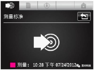
1. Select the Best Match function.
2. Measure the paper.
3. Tap the measurement standard icon or tap the standard icon to enter the screen where you can measure from the library or select a standard.
4. Measure the standard, use the last reading, or select from the PANTONE library.
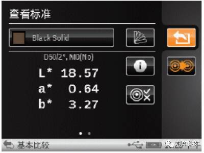
5. Tap the "Return" icon to return to the measurement screen.
6. Measure the comparison sample.
7. View the measurement results.

(As shown in the image above)
Left screen
The first value is the current Delta E of the current standard sample. The smallest number represents the measured density response and spot ink value. The arrow indicates the direction in which the density should be adjusted.
Depending on the Best Match function settings selected, glossy coated paper or matte paper is displayed in the lower left corner. This will affect the formula for estimating the correction. This should be set according to the measured substrate.
Right screen
The first value represents the estimated color difference after the suggested adjustment is made. The second value is the suggested density adjustment (positive or negative).
This function also allows us to easily find the optimal ink density and tells us how to achieve it.
X-Rite eXact has three versions; only the standard and advanced versions support the "Best Match" function.
X-Rite eXact Handheld Spectrophotometer
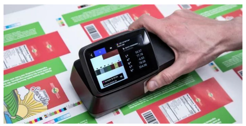
X-Rite eXact is a new generation of handheld color measurement solutions, adapting to new business needs and the dynamics of the global supply chain. X-Rite eXact allows printing plants and packaging converters to truly understand, control, and manage color within the entire color network, ensuring optimal color accuracy.
X-Rite eXact Density Version: Suitable for those who want a traditional toolset and the ability to add more functional options as their needs change for CMYK operation.
X-Rite eXact Standard Version: Ensures accurate CMYK and spot color printing and leverages industry-standard spectrophotometry in process control.
X-Rite eXact Advanced Version: Ensures that ink labs, quality control labs, and manufacturing partners obtain the highest quality spectrophotometer with the broadest toolset.
-end-
Some of the pictures and texts in this site are collected and collated from the network for learning and exchange only. The copyright belongs to the original author. If you have violated your rights, please contact us to delete them in time.
More News
Kaiyin Technology - Awarded "Specialized and New Enterprise"
Kaiyin Technology, with its professional R&D and service teams, sound management system, and excellent innovation mechanism, successfully passed the enterprise self-assessment, Shenzhen municipal preliminary examination, and national ministry review procedures, ultimately winning multiple honorary titles including "Specialized and New Enterprise," "High-tech Enterprise," and "Innovative Small and Medium-sized Enterprise." The acquisition of these honors is a high recognition of Kaiyin Technology's innovation capabilities, technological R&D strength, and industry specialization, and further affirmation of the company's innovative development achievements. It marks another significant step forward for Kaiyin Technology in technological innovation and development in its specialized field.
Closed-loop control system—enabling automation of process control in offset printing presses
Commercial printers using older offset presses may find it challenging to achieve the same color consistency as those equipped with new presses featuring automated color control. Integrating closed-loop solutions offers a cost-effective path to automation, enabling commercial print shops and folding carton converters to remain competitive in today’s market. Currently, print jobs often require manual spot checks and ink-key adjustments during production. Many printers struggle to quickly attain target offset lithographic colors on sheetfed presses.
PRINTING United Alliance has released G7+™, the next stage in color calibration. G7+ is an enhanced specification that builds on the classic G7® by adding new logic, algorithms, and features, while maintaining a similar overall appearance.
Color Technology Sharing | How to Avoid Product Color Differences?
Although color evaluation can be subjective and emotional, modern color measurement addresses this challenge by providing fact-based analysis and spectral data, ensuring that everyone speaks the same “color language.”

Service Hotline:
180 8888 0185
Address:
605, Building B1, Funian Plaza, No. 3, Shihua Road, Futian District, Shenzhen, Guangdong
Tel:
Fax:
Email:
Copyright ©Shenzhen Kaiyin Technology Co., Ltd 粤ICP备16126578号 SEO
Website support:300.cn ShenZhen
Mobile: 180 8888 0185
Tel: +86 755 8280 8180
Address: 305A, Floor 3, Building B1, Funian Plaza, No. 3, Shihua Road, Futian District, Shenzhen, Guangdong
Email: service@kngcolor.com
We will give you feedback in time


