
Full process prepress and color management solution | National high-tech enterprise | Aisele+Kaiyin Technology Color Lab
180 8888 0185


Service Hotline:
+86 18088880185
Color Management Consulting
Service Hotline: +86 18088880185

Technical Information
Printing technology sharing and the latest industry trends
Technical Sharing | Optical Brightener Compensation (OBC)
Release Time: 2024-02-23 00:00:00.000
What is Optical Brightener Compensation (OBC)?
Whether you're a photographer printing artwork for a gallery or a professional printer producing billboards, packaging, related materials, or other commercial items, using optical brighteners in paper can lead to color shifts, making it difficult to match samples and maintain color consistency. However, these phenomena are often related to optical brighteners. With X-Rite color management solutions, you can easily correct this phenomenon and generate and display colors as you wish. Paper manufacturers often use optical brighteners to make yellowish paper appear whiter and brighter to the human eye.
Sunlight contains abundant ultraviolet light. Optical brighteners (OBAs) are commonly used additives in paper. This additive absorbs ultraviolet light with a wavelength below 400nm and converts it into blue-violet light with a wavelength between 400 and 450nm, thereby increasing the whiteness of the paper. This can lead to significant color differences compared to paper without optical brighteners under actual viewing conditions containing ultraviolet light.
To address the impact of optical brighteners on color measurement, X-Rite actively advocates and is committed to the forefront of standard design, and advocates the concept of "standard-based printing." At the same time, ISO 13655-2009 has established standard illumination conditions applicable to substrates containing different brighteners, which mainly include four measurement illumination conditions.
Challenges of Separate Measurements
Visual challenges: The effect of optical brighteners on paper depends on the lighting conditions. The same paper will have different effects under different lighting conditions.
Measurement without physical filters (without filters): Technically speaking, paper containing optical brighteners will appear slightly blue during spectral measurement, but this does not match what you actually see.
UVcut filter measurement: When measuring with a UVcut filter, the optical brightener on the paper is not triggered, causing the measurement to show the paper as yellowish, but this is still inconsistent with what you actually see.
The best match between measured values and visual effects lies between these two measurements.
Optical Brightener Solution
In practical production applications, to avoid the influence of optical brighteners, it is necessary to select reasonable measurement conditions based on the characteristics of the paper and the final inspection requirements, and then use these measurement conditions to create characteristic files. At the same time, this type of light source needs to be used for proofing to ensure color consistency. The above operation is very complex, and it is very difficult to maintain the best match between the visual effect and the measurement results of the sample containing optical brighteners. To achieve better results, color management needs to compensate for the optical brighteners in the paper.
When calculating ICC profiles, some applications provide simulated correction for optical brighteners on paper. These applications often attempt to compensate for the "blue" measurement by adding yellow or removing more than 100% reflectance.
If the printed paper contains optical brighteners, the best possible match between visual effect and measurement results depends on the ambient lighting conditions and can be achieved using the X-Rite optical brightener compensation function in i1Profiler software. X-Rite optical brighteners provide scientific correction for measurements, rather than visually unreplicable simulations in prints.
Product Requirements
i1Pro 2/3 - The first handheld color management spectrophotometer with dual light source function, suitable for 3 standard measurement environments (ISO 13655 MO tungsten lamp: ISO 13655 M1: D50: ISO 13655 M2UV Cut), and equipped with optical brightener compensation (OBC), no need to change filters or use additional instruments.
i1iSis2 or iliSis2 XL - Automatic color chart readers can use UV-cut (only visible light other than ultraviolet light) and UVonly (only ultraviolet light in the same measurement cycle) to measure test charts. X-Rite i1Profiler color management software.
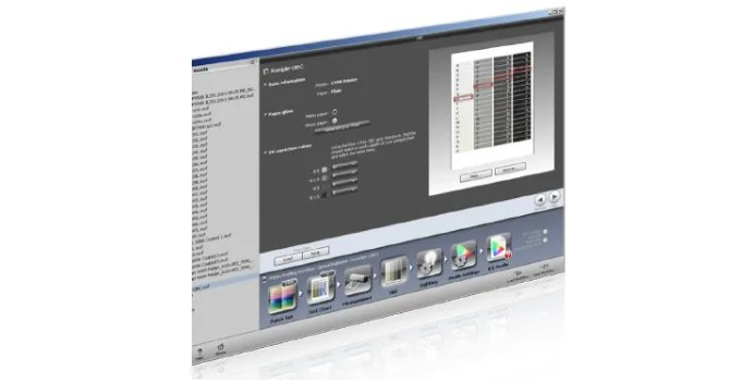
How to Operate
-
Connect the i1 spectrophotometer (i1Pro 2 or iliSis), enter the i1Profiler software and select the advanced user mode.
-
Select the required workflow - CMYK or RGB printer OBC color management
-
Arrange and print test charts directly from i1Profiler or other applications, such as Adobe Photoshop or other RIP software.
-
Measure the test chart using a device with dual OBC mode. This process will determine the reflectance ratio of the printed color and the reflectance ratio of the optical brightener in each area.
-
Generate an OBC grayscale evaluation chart, printed directly from i1Profiler or other applications, such as Adobe Photoshop or RIP software. This chart contains four columns, each representing a different gray level.
-
Compare the printed grayscale evaluation chart with the OBC standard (grayscale standard) provided by i1. Select and mark the area that provides the best visual match from the relevant column (light gray to dark gray).
-
Enter the UV correction value (A-S) related to the gray area that matches the OBC software screen.
-
Proceed to define the required color configuration settings as usual, and then generate your ICC profile. Your CC profile will contain the correct data to compensate for all OBAs in the printing substrate.
Result: Compared to CC profiles using only filterless and Uvcut filter measurements, files corrected with OBC results produce better visual effects when printed.
Some of the pictures and texts in this site are collected and collated from the network for learning and exchange only. The copyright belongs to the original author. If you have violated your rights, please contact us to delete them in time.
More News
Kaiyin Technology - Awarded "Specialized and New Enterprise"
Kaiyin Technology, with its professional R&D and service teams, sound management system, and excellent innovation mechanism, successfully passed the enterprise self-assessment, Shenzhen municipal preliminary examination, and national ministry review procedures, ultimately winning multiple honorary titles including "Specialized and New Enterprise," "High-tech Enterprise," and "Innovative Small and Medium-sized Enterprise." The acquisition of these honors is a high recognition of Kaiyin Technology's innovation capabilities, technological R&D strength, and industry specialization, and further affirmation of the company's innovative development achievements. It marks another significant step forward for Kaiyin Technology in technological innovation and development in its specialized field.
Closed-loop control system—enabling automation of process control in offset printing presses
Commercial printers using older offset presses may find it challenging to achieve the same color consistency as those equipped with new presses featuring automated color control. Integrating closed-loop solutions offers a cost-effective path to automation, enabling commercial print shops and folding carton converters to remain competitive in today’s market. Currently, print jobs often require manual spot checks and ink-key adjustments during production. Many printers struggle to quickly attain target offset lithographic colors on sheetfed presses.
PRINTING United Alliance has released G7+™, the next stage in color calibration. G7+ is an enhanced specification that builds on the classic G7® by adding new logic, algorithms, and features, while maintaining a similar overall appearance.
Color Technology Sharing | How to Avoid Product Color Differences?
Although color evaluation can be subjective and emotional, modern color measurement addresses this challenge by providing fact-based analysis and spectral data, ensuring that everyone speaks the same “color language.”

Service Hotline:
180 8888 0185
Address:
605, Building B1, Funian Plaza, No. 3, Shihua Road, Futian District, Shenzhen, Guangdong
Tel:
Fax:
Email:
Copyright ©Shenzhen Kaiyin Technology Co., Ltd 粤ICP备16126578号 SEO
Website support:300.cn ShenZhen
Mobile: 180 8888 0185
Tel: +86 755 8280 8180
Address: 305A, Floor 3, Building B1, Funian Plaza, No. 3, Shihua Road, Futian District, Shenzhen, Guangdong
Email: service@kngcolor.com
We will give you feedback in time


