
Full process prepress and color management solution | National high-tech enterprise | Aisele+Kaiyin Technology Color Lab
180 8888 0185


Service Hotline:
+86 18088880185
Color Management Consulting
Service Hotline: +86 18088880185

Technical Information
Printing technology sharing and the latest industry trends
Color Management Sharing | Why is there a "color difference" between design and print?
Release Time: 2024-05-08 09:00:00.000
Color difference refers to the difference in color perception between two samples, including differences in lightness, saturation, and hue. A colorimeter measures the two colors, and a color difference formula calculates the difference. Visual evaluation of color difference between samples involves placing the two objects together under specified lighting and viewing conditions for visual assessment. Visual estimation determines the difference and direction between colors, but not the grade difference. If color difference can be represented by the distance between two points, it achieves digital expression. Colorimetry is commonly used to determine the difference between colors.
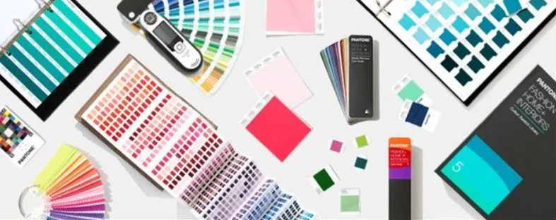
Color Card Color Comparison
The accuracy of color matching results using color cards can be affected by the quality of the color cards themselves, the color matching method, and the observer's conditions.
1. Color Card Types
There are many types of color cards available. Different brands have different standards, and even within the same brand, there are various models. Using different color cards makes accurate color comparison difficult.
2. Color Card Quality
Some users choose inexpensive color cards, but these may not meet standards, leading to color differences. Color cards can also wear, fade, and age over time, requiring regular replacement. Otherwise, even high-quality color cards may produce inaccurate color comparisons.
3. Color Matching Methods
Incorrect color matching methods can lead to color differences. The light source, viewing angle, and surrounding colors are crucial when using color cards. For more accurate color assessment, a standard light source color matching light box is recommended.
4. Observer's Conditions
Individuals have varying sensitivities to color. Some have strong color discrimination abilities, while others may struggle to distinguish between red and green. Therefore, the observer's factors significantly impact color card comparison results.
Problems in Color Card Use
Although color cards are produced under strict standards, various factors can affect production, making it impossible to ensure identical color card production. Different usage conditions of the color cards themselves can also cause color differences.
-
Different states of color card use lead to differences in color hue. Newly purchased color cards and those used for a long time will inevitably show color changes, leading to errors.
-
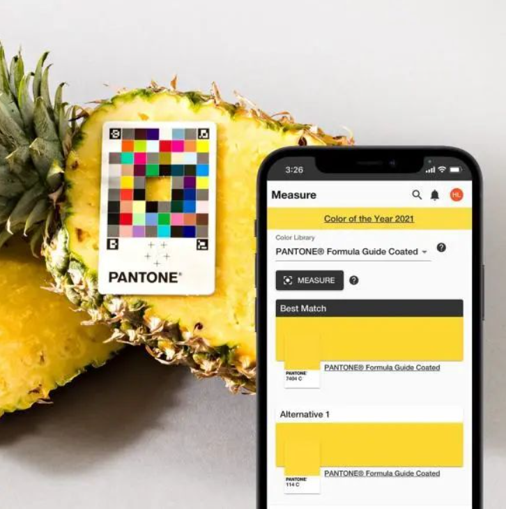
Using a digital spot color library allows for intuitive color observation and data acquisition. However, differences in display quality among monitors can cause the same color number to appear differently.
-
In different versions of graphic image software, the device-independent representation data values for the same color number may differ.
Why are there "color differences" between design and printed products?
Every designer has likely encountered color difference issues. Colors appear normal on the computer screen, but the printed product shows color differences. Incorrect colors can affect the entire design and hinder the designer's vision. So, how do color differences arise? How can they be reduced? Is the designer or printer responsible?
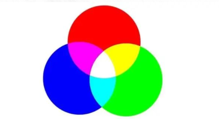
1. RGB and CMYK Mode Influence RGB and CMYK are the two most commonly used color modes by designers. Let's talk about RGB mode. As the name suggests, it is a color mode based on red, green, and blue (the three primary colors).
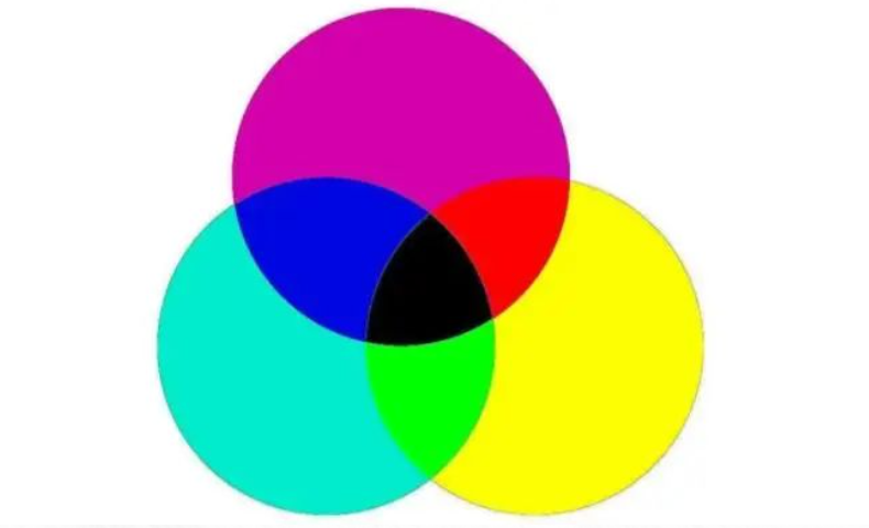
Each primary color has 255 levels of brightness, and 255-level RGB colors can combine to create approximately 16.78 million colors. Therefore, in daily life, RGB mode is generally used for the displays of computers, mobile phones, projectors, and televisions. When describing colors using RGB mode, the transmission medium is the display. However, if you need to print the designed work, the medium is the ink. Inks also have three colors, usually called the three primary ink colors: cyan, magenta, and yellow.
Theoretically, only CMY inks are needed for printing; overlapping them should produce black. However, due to manufacturing limitations, high-purity inks cannot be produced. CMY actually produces dark gray, insufficient for the darkest parts. Therefore, black is added and mixed with the other three colors. Black makes dark details clearer and mid-tones and dark tones more distinct. To avoid confusion with RGB's B, black uses its last letter K, combining with CMY to form the CMYK color mode. CMYK mode is used for printing because the addition of black makes the final colors darker than RGB mode. RGB has a wider color gamut than CMYK, meaning that many bright colors displayed on screens are impossible to achieve with ink printing.
2. Uncontrollable Factors in the Printing Process
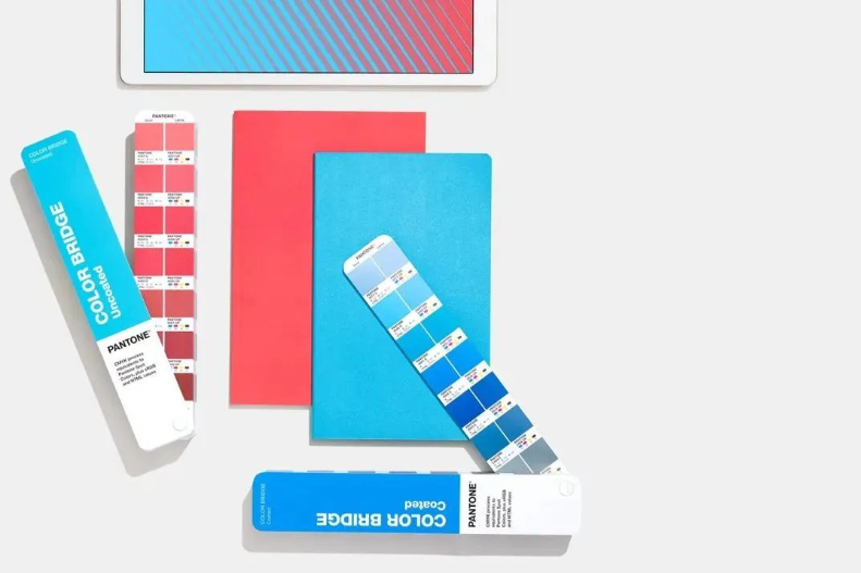
Even if designers use CMYK mode, many uncontrollable factors affect the actual process. For example, human error by the printer, paper with different whiteness, paper gloss and smoothness, types of printing inks, and the light source of the proofing station. These will not be explained in detail here. In short, many factors affect color accuracy. Designers can try to control color differences during the design phase. RGB mode is the best color mode for displays on computers, mobile phones, projectors, and televisions. If the design needs to be displayed on these devices, RGB mode is preferred. If it needs to be produced using inkjet printing, photo printing, or other printing methods, CMYK mode must be used during design. Designers can use appropriate Pantone color tools to check and reduce color differences.
How to control these color differences is welcome for discussion and exchange.
How to manage these color differences, welcome to follow and communicate.
如何管控好这些色差,欢迎关注交流。
Some of the pictures and texts in this site are collected and collated from the network for learning and exchange only. The copyright belongs to the original author. If you have violated your rights, please contact us to delete them in time.
More News
Kaiyin Technology - Awarded "Specialized and New Enterprise"
Kaiyin Technology, with its professional R&D and service teams, sound management system, and excellent innovation mechanism, successfully passed the enterprise self-assessment, Shenzhen municipal preliminary examination, and national ministry review procedures, ultimately winning multiple honorary titles including "Specialized and New Enterprise," "High-tech Enterprise," and "Innovative Small and Medium-sized Enterprise." The acquisition of these honors is a high recognition of Kaiyin Technology's innovation capabilities, technological R&D strength, and industry specialization, and further affirmation of the company's innovative development achievements. It marks another significant step forward for Kaiyin Technology in technological innovation and development in its specialized field.
Closed-loop control system—enabling automation of process control in offset printing presses
Commercial printers using older offset presses may find it challenging to achieve the same color consistency as those equipped with new presses featuring automated color control. Integrating closed-loop solutions offers a cost-effective path to automation, enabling commercial print shops and folding carton converters to remain competitive in today’s market. Currently, print jobs often require manual spot checks and ink-key adjustments during production. Many printers struggle to quickly attain target offset lithographic colors on sheetfed presses.
PRINTING United Alliance has released G7+™, the next stage in color calibration. G7+ is an enhanced specification that builds on the classic G7® by adding new logic, algorithms, and features, while maintaining a similar overall appearance.
Color Technology Sharing | How to Avoid Product Color Differences?
Although color evaluation can be subjective and emotional, modern color measurement addresses this challenge by providing fact-based analysis and spectral data, ensuring that everyone speaks the same “color language.”

Service Hotline:
180 8888 0185
Address:
605, Building B1, Funian Plaza, No. 3, Shihua Road, Futian District, Shenzhen, Guangdong
Tel:
Fax:
Email:
Copyright ©Shenzhen Kaiyin Technology Co., Ltd 粤ICP备16126578号 SEO
Website support:300.cn ShenZhen
Mobile: 180 8888 0185
Tel: +86 755 8280 8180
Address: 305A, Floor 3, Building B1, Funian Plaza, No. 3, Shihua Road, Futian District, Shenzhen, Guangdong
Email: service@kngcolor.com
We will give you feedback in time


