
Full process prepress and color management solution | National high-tech enterprise | Aisele+Kaiyin Technology Color Lab


Technical Information
Printing technology sharing and the latest industry trends
Color Management Technology | Establishing Flexographic Process Control
Release Time: 2024-05-29 00:00:00.000
To achieve predictable and repeatable color on a flexographic press, you need good color management and reliable process control. Otherwise, your colors will really fluctuate. While the initial work may require some effort, it's worthwhile. The results will lead to greater customer satisfaction, and you'll save time and money through faster setup times and fewer reprints.
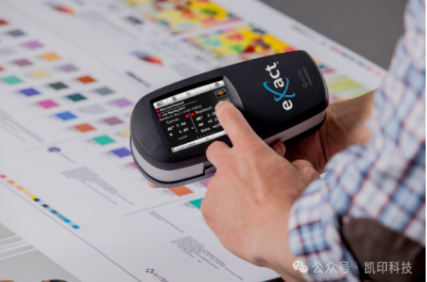
eXact eliminates problems in flexographic process control
1. Establish color management
If you are proofing on an uncalibrated press, if the plates you make are unverified, and if the press run does not have proper color measurement, there is no way to tell if the color you are viewing is correct. Color management ensures that your equipment produces consistent, accurate color in each job and between jobs.
2. Invest in color measurement instruments
You cannot rely on your eyes to judge color accuracy. Human color perception is subjective and limited by external factors, while color measurement equipment is objective and without the same limitations. In the flexographic workflow, spectrophotometers can be used for quality control of proofing and press output, as well as for calibrating proofers and presses. Contact us if you need help choosing the instrument best suited to your needs.
3. Refer to ISO standards
The International Organization for Standardization provides ISO 12647-6 as a set of printing standards. ISO 12647-6 is specific to flexography. This standard not only defines solid ink density target numbers, but also looks at actual color values. The best L*a*b* targets are established by the printer for a given substrate.
Here are some resources that can help:
-
The FTA (Flexographic Technical Association) has developed a specification manual called FIRST, which includes general guidelines for producing high-quality prints according to ISO 12647-6.
-
EFIA (European Flexographic Industry Association) also provides guidelines and manuals on flexographic printing practices.
4. Set production targets
Process control begins with establishing target values and then adjusting the process to achieve those values. For production, you need more than just the hue angle of the ink and the L*a*b* of the substrate color. Production targets must include specific L*a*b* values for solid inks and overprints, as well as TVI values. These values can come from published target values or from custom values developed on your press. Most importantly, establish standard target values for production under each press condition you run.
5. Create targets and tolerances
The first step must be to optimize the press settings. This will determine the best combination of line screens, anilox rolls, ink strength, plates, mounting tape, and other press settings to suit your chosen substrate and application.
Next, determine the targets or target values that will be used when measuring control targets in production. The patches to be measured include the printing ink colors and any spot colors, gray balance patches, overprint/ink patches, and tone scales that will be used in production. There will also be many test elements, including vignettes, impressions, slanders, registration, and other visual assessments of print quality. The measurements of the patches will be recorded as production targets.

Measurements of samples throughout the run will be used to help calculate the expected variation in this print run. If the variation is greater than the specified production tolerance, the specifications or pressure conditions, or both, must be adjusted. These new targets and tolerances can also be used for future runs. When preparation or production measurements show that you are outside the tolerance range, you know there is a problem that needs to be addressed. The earlier it is found and addressed in the production process, the more cost-effective the production process will be.
6. Proofing in the workflow
A good proof represents the target achievable by the press. It can be used to obtain customer approval to run the job and to show the customer what they want to achieve. In some cases, they are not even made by the print provider. If you are running custom press conditions, you will need to provide your own measurements or ICC profiles.
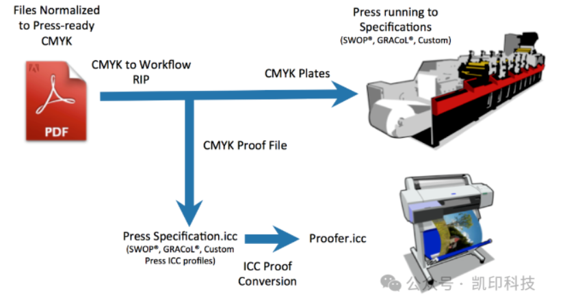
Most inkjet proofing systems can simulate the press using ICC profiles or measurement files from characterized reference print conditions
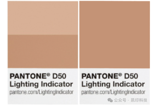
7. View proofs under standard lighting
Incorrect lighting conditions can alter the way you see color. In fact, insufficient light can alter the color of the proof in a different way than the printing paper. If the press operator views the proof and print samples under incorrect lighting and makes changes based on what they see rather than what is measured, the color will be wrong.
Always view your prints under lighting conditions that meet ISO standards. In addition to D50 (daylight), you may need to view production samples under other simulated store or home lighting to ensure that different parts of the packaging (such as labels and cartons) continue to match on the shelf or in the consumer's home.
8. Monitor printing pressure
Control targets are the most important tool for monitoring pressing behavior. It should include patches representing ink, overprint, tone value increase, and gray balance. You can measure these bars and then compare them to target points and tolerances called "standards".
Sometimes these standards are defined by ISO, while other times print conditions will require you to define custom standards by test.

Correct ink density does not necessarily mean good color. Take these images as an example...they have the same ink density, but look very different. Which one is correct? The problem may be related to tone value increase, overprint, or ink smudging. But these images show that we cannot rely solely on ink density to achieve accurate color.
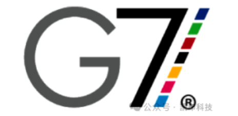
9. Take the G7 process as an example
G7 is an implementation of ISO standard 10128, focusing on near-neutral calibration. It is widely used in North America and gaining recognition worldwide. G7 can help you achieve consistent gray balance using many different printing processes and applications. The main idea behind G7 is that it uses plate curves to define a method of neutral gray balance from highlights to shadows. To achieve gray balance, each color will have a unique plate curve and its own TVI.
10. Develop Standard Operating Procedures (SOP)
Once you reach this stage, you need to document everything and communicate it to everyone involved in the workflow. Standard Operating Procedures (SOPs) provide direction, help solve problems, and make training new employees easier. When SOPs are correctly developed and implemented, they also ensure that everyone in the organization operates in the same way, regardless of their shift or location.
ISO has established industry standards, and each region has developed specifications and best practices to achieve these standards. To produce repeatable, accurate colors on a flexographic press, you must operate the system to meet these specifications and standards, use proofs that simulate the same printing conditions, and view your prints under correct lighting.
Some of the pictures and texts in this site are collected and collated from the network for learning and exchange only. The copyright belongs to the original author. If you have violated your rights, please contact us to delete them in time.
More News
Kaiyin Technology - Awarded "Specialized and New Enterprise"
Kaiyin Technology, with its professional R&D and service teams, sound management system, and excellent innovation mechanism, successfully passed the enterprise self-assessment, Shenzhen municipal preliminary examination, and national ministry review procedures, ultimately winning multiple honorary titles including "Specialized and New Enterprise," "High-tech Enterprise," and "Innovative Small and Medium-sized Enterprise." The acquisition of these honors is a high recognition of Kaiyin Technology's innovation capabilities, technological R&D strength, and industry specialization, and further affirmation of the company's innovative development achievements. It marks another significant step forward for Kaiyin Technology in technological innovation and development in its specialized field.
Standardized Color Management Strategy for Enhancing Brand Image
Standardization Strategy for Color Management to Enhance Brand Image In today's increasingly competitive market, brand image has become a key factor in a company's success or failure. Color, as an important element affecting brand image, requires standardized management. So, what is color management standardization? Simply put, it is using a consistent color strategy to ensure brand consistency across different channels and touchpoints. Next, we will delve into how to enhance brand image through color management standardization. Psychological Effects of Color Have you noticed that the colors of certain brands can unintentionally resonate with your emotions? For example, red often evokes passion and vitality, while blue gives a sense of stability and trust. These psychological effects of color are not accidental but rather carefully considered strategic choices. Through color management standardization, companies can leverage these psychological effects to enhance consumer brand recognition. For example, fast-food brands often use bright colors to stimulate appetite and desire to buy, while luxury brands tend to use dark tones to convey nobility and elegance. Necessity of Color Management Standardization Imagine if a brand uses bright orange in its online store but uses cool gray in its physical store. This inconsistency will confuse consumers and weaken brand recognition. Therefore, color management standardization is crucial for maintaining a consistent brand image and enhancing consumer trust.
Prepress physical proofing: An important step in improving print quality
Pre-press physical proofing: A crucial step in improving the quality of printed products. In the printing industry, pre-press physical proofing is an indispensable key step. It helps customers and printing companies confirm the design effect in advance, avoiding deviations between the finished product and expectations, thereby reducing unnecessary cost waste. Through physical proofing, the details of color, material, and process can be visually inspected to ensure that the final printed product meets the requirements. The advantage of pre-press physical proofing is that it provides a real sample reference. Compared with digital proofing, physical proofing is closer to the effect of the final product, especially in the application of special processes such as gilding, UV, and embossing. Customers can touch and observe the sample to more accurately evaluate the actual effect and make reasonable adjustments. In addition, physical proofing can also help printing companies optimize production processes, discover potential problems in advance, and improve overall production efficiency. In actual operation, the pre-press physical proofing process usually includes design confirmation, material selection, proofing production, and effect evaluation. Each link needs to be treated rigorously to ensure the accuracy and reliability of the proofing. For example, in color management, professional proofing technology can restore the colors of the design draft to avoid affecting the final effect due to color difference problems. At the same time, choosing the right proofing materials is also very important.
Explore best practices for color management standardization
Exploring Best Practices in Color Management Standardization In modern design and production processes, the importance of color management is self-evident. Have you ever been confused by inconsistent colors in a design project? Do color differences when viewing the same image on different screens leave you feeling helpless? This is where color management standardization comes into play. It not only improves work efficiency but also significantly improves the visual effects of the final product. Let's explore the best practices of color management standardization together. What is color management standardization? Simply put, color management standardization refers to a series of specifications and processes designed to ensure color consistency between different devices (such as monitors, printers, etc.). Imagine how embarrassing it would be if you saw the same poster in different places, but the colors were different each time! Through standardization, we can ensure that designers, printers, and customers see consistent colors. Why is color management standardization so important? First, color management standardization can enhance brand image. Whether in advertising, packaging, or product displays, consistent colors make the brand look more professional. Imagine if a company's logo looks different across different channels, how would customers view that brand? Its


Service Hotline:
180 8888 0185
Address:
605, Building B1, Funian Plaza, No. 3, Shihua Road, Futian District, Shenzhen, Guangdong
Tel:
Fax:
Email:
Copyright ©Shenzhen Kaiyin Technology Co., Ltd 粤ICP备16126578号 SEO
Website support:300.cn ShenZhen
Mobile: 180 8888 0185
Tel: +86 755 8280 8180
Address: 305A, Floor 3, Building B1, Funian Plaza, No. 3, Shihua Road, Futian District, Shenzhen, Guangdong
Email: service@kngcolor.com
We will give you feedback in time


