
Full process prepress and color management solution | National high-tech enterprise | Aisele+Kaiyin Technology Color Lab


Technical Information
Printing technology sharing and the latest industry trends
Color Technology Sharing | Why Your Colors Are Prone to Errors in Printing: Inks and Standards (Part 2)
Release Time: 2024-05-31 09:00:00.000
Under normal circumstances, you should be able to put ink into the press, run the job, and achieve color consistency. Unfortunately, flexographic and gravure operations waste ink, substrates, and press time every year trying to get the color right. Despite advancements in technology that make achieving color accuracy easier, variables that affect color still exist. In this three-part series, we will share over twenty reasons why your color may be off in print. If you missed Part 1 Instrumentation Please check it out first. We will explore how your standards and inks affect the final color.

1. Using the Wrong Color Standard
It is easy to accidentally select the wrong color standard in software. Some systems have hundreds of color standards. For this situation, the following points should be noted:
-
Check to ensure that the standard you select has the same characteristics as the job you are printing.
-
Organize your standards by customer, including details such as substrate, screen ruling, ink system, etc.
-
Input standards with the correct instrument settings and backing material.
-
Make sure the color standard is on the same sheet of paper as the printed sample. For example, you cannot compare an uncoated Pantone color on bleached white stock to an off-white, mottled white corrugated board.
2. Using Too Many Base Inks
Using too many base inks may not achieve your target color or saturation, which often leads to fruitless efforts, as each ink has a different spectral composition of reflected light. An ink should be formulated with as few base inks as possible.

3. Changing Substrates
Is the substrate on the press exactly the same as the substrate used to create the standard? Does the substrate supplier have difficulty providing consistent material? Is the material bottom-laminated material different from yesterday? Are you comparing using matte polyethylene and clear lamination?
Changes in substrate can have a huge impact on how color reads on press. Consider making your substrate a physical standard in your workflow, just like using ink draws. Also, Check your substrate to ensure it is within tolerance before checking any colors, then adjust the ink or run the job.

4. Ignoring Overprint Varnish
Overprint varnish (OPV) is often overlooked because it is clear, but don't let that fool you. OPV can greatly affect color shifts. Typically, overprint varnish will cause the color to shift toward the blue side. It can also make the color appear darker and richer. In most color overprint varnishes, you will see a decrease in the L value. If you are unsure, take some readings with and without OPV to see what the difference is. If your print job requires OPV, it is best to use OPV to input your color standard, as this is the final condition the customer will see. Problems also arise when spot OPV goes through the center of the color bar. Since some readings will have OPV and some will not, you will get inconsistent readings.
5. Using a Bad Batch of Ink
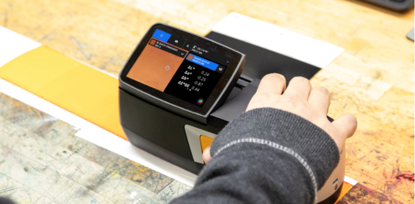
Even with the best ink technology, a bad batch of ink can happen. However, if this problem is not noticed immediately, it can lead to hours of ink adjustment and press waste. One way to address this is to establish a quality assurance plan with your ink room to ensure the correct ink is about to be printed. Common practice is to attach a COA (Certificate of Analysis) sheet to the batch about to be printed to ensure accuracy. You should also measure and verify the ink before putting it into production.
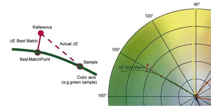
The BestMatch function on the eXact is a predictive color tool that looks at concentration and ink thickness to see if you can get the right color. It can also help you determine if you can achieve a closer match to the specified color by adjusting the ink on the press.
6. Contamination
This is common in busy print shops. Press operators, especially when running solvent-based and water-based inks, must use stabilizers, glycols, alcohols, water, etc., to maintain ink performance. Too many additives will actually ruin the ink. Another common problem, when everyone is in a hurry and production needs to go out the door, is skipping the step of thoroughly cleaning the press, sump, and fountain when changing colors.
Once a color is contaminated, the only way to correct it may be to start over. The basic comparison tool on the eXact 2 can compare the ink in the press to the ink in a new container to check for contamination. A less scientific method is to drop ink from the press onto the lid of the original ink container. If you find a huge difference between the two, it is likely that your ink is contaminated.
7. Improper Ink Drying
Improper ink drying can lead to ink duct contamination. It may or may not affect your color, but it is important to note this. In extreme cases, if other inks are not dried properly, the yellow ink sump may turn completely orange or even brown.
8. Different Opacity
Different ink colors have different opacities. Worse yet, ink companies use multiple ink systems and dozens of suppliers, creating even more unknowns in terms of opacity differences. eXact 2 supports opacity readings You can avoid wasting time and money by taking opacity readings. Understanding your opacity capabilities can help you set clear customer expectations.
Some of the pictures and texts in this site are collected and collated from the network for learning and exchange only. The copyright belongs to the original author. If you have violated your rights, please contact us to delete them in time.
More News
Kaiyin Technology - Awarded "Specialized and New Enterprise"
Kaiyin Technology, with its professional R&D and service teams, sound management system, and excellent innovation mechanism, successfully passed the enterprise self-assessment, Shenzhen municipal preliminary examination, and national ministry review procedures, ultimately winning multiple honorary titles including "Specialized and New Enterprise," "High-tech Enterprise," and "Innovative Small and Medium-sized Enterprise." The acquisition of these honors is a high recognition of Kaiyin Technology's innovation capabilities, technological R&D strength, and industry specialization, and further affirmation of the company's innovative development achievements. It marks another significant step forward for Kaiyin Technology in technological innovation and development in its specialized field.
Standardized Color Management Strategy for Enhancing Brand Image
Standardization Strategy for Color Management to Enhance Brand Image In today's increasingly competitive market, brand image has become a key factor in a company's success or failure. Color, as an important element affecting brand image, requires standardized management. So, what is color management standardization? Simply put, it is using a consistent color strategy to ensure brand consistency across different channels and touchpoints. Next, we will delve into how to enhance brand image through color management standardization. Psychological Effects of Color Have you noticed that the colors of certain brands can unintentionally resonate with your emotions? For example, red often evokes passion and vitality, while blue gives a sense of stability and trust. These psychological effects of color are not accidental but rather carefully considered strategic choices. Through color management standardization, companies can leverage these psychological effects to enhance consumer brand recognition. For example, fast-food brands often use bright colors to stimulate appetite and desire to buy, while luxury brands tend to use dark tones to convey nobility and elegance. Necessity of Color Management Standardization Imagine if a brand uses bright orange in its online store but uses cool gray in its physical store. This inconsistency will confuse consumers and weaken brand recognition. Therefore, color management standardization is crucial for maintaining a consistent brand image and enhancing consumer trust.
Prepress physical proofing: An important step in improving print quality
Pre-press physical proofing: A crucial step in improving the quality of printed products. In the printing industry, pre-press physical proofing is an indispensable key step. It helps customers and printing companies confirm the design effect in advance, avoiding deviations between the finished product and expectations, thereby reducing unnecessary cost waste. Through physical proofing, the details of color, material, and process can be visually inspected to ensure that the final printed product meets the requirements. The advantage of pre-press physical proofing is that it provides a real sample reference. Compared with digital proofing, physical proofing is closer to the effect of the final product, especially in the application of special processes such as gilding, UV, and embossing. Customers can touch and observe the sample to more accurately evaluate the actual effect and make reasonable adjustments. In addition, physical proofing can also help printing companies optimize production processes, discover potential problems in advance, and improve overall production efficiency. In actual operation, the pre-press physical proofing process usually includes design confirmation, material selection, proofing production, and effect evaluation. Each link needs to be treated rigorously to ensure the accuracy and reliability of the proofing. For example, in color management, professional proofing technology can restore the colors of the design draft to avoid affecting the final effect due to color difference problems. At the same time, choosing the right proofing materials is also very important.
Explore best practices for color management standardization
Exploring Best Practices in Color Management Standardization In modern design and production processes, the importance of color management is self-evident. Have you ever been confused by inconsistent colors in a design project? Do color differences when viewing the same image on different screens leave you feeling helpless? This is where color management standardization comes into play. It not only improves work efficiency but also significantly improves the visual effects of the final product. Let's explore the best practices of color management standardization together. What is color management standardization? Simply put, color management standardization refers to a series of specifications and processes designed to ensure color consistency between different devices (such as monitors, printers, etc.). Imagine how embarrassing it would be if you saw the same poster in different places, but the colors were different each time! Through standardization, we can ensure that designers, printers, and customers see consistent colors. Why is color management standardization so important? First, color management standardization can enhance brand image. Whether in advertising, packaging, or product displays, consistent colors make the brand look more professional. Imagine if a company's logo looks different across different channels, how would customers view that brand? Its


Service Hotline:
180 8888 0185
Address:
605, Building B1, Funian Plaza, No. 3, Shihua Road, Futian District, Shenzhen, Guangdong
Tel:
Fax:
Email:
Copyright ©Shenzhen Kaiyin Technology Co., Ltd 粤ICP备16126578号 SEO
Website support:300.cn ShenZhen
Mobile: 180 8888 0185
Tel: +86 755 8280 8180
Address: 305A, Floor 3, Building B1, Funian Plaza, No. 3, Shihua Road, Futian District, Shenzhen, Guangdong
Email: service@kngcolor.com
We will give you feedback in time


