
Full process prepress and color management solution | National high-tech enterprise | Aisele+Kaiyin Technology Color Lab
180 8888 0185


Service Hotline:
+86 18088880185
Color Management Consulting
Service Hotline: +86 18088880185

Technical Information
Printing technology sharing and the latest industry trends
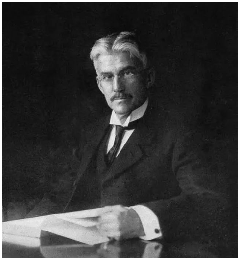
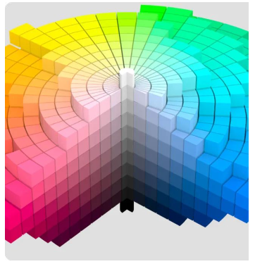
Color Management | Munsell Color System A vibrant and long-standing legacy
Release Time: 2024-12-28 11:51:44.000
Whenever archaeologists uncover tiny artifacts, such as a shard of pottery, a few beads, or some bone fragments, they are able to weave a story of how people lived centuries before us. Most of these incredible narratives are revealed through color, specifically through a color standard designed by a man named Albert H. Munsell.
What is the Munsell Color System?
Driven by a passion to communicate color objectively and non-emotionally, much like musical notes convey a specific melody, Munsell began researching color theory in the late 19th century. At the time, this was a largely undeveloped science. In 1905, Munsell published a color system based on three dimensions: hue (the color itself), value (the lightness or darkness of a color), and chroma (the purity or intensity of a color). By assigning numerical scales to each dimension, Munsell’s system created a standard that could accurately identify colors and define the relationships between different colors.
A World Forever Changed – Applications of the Munsell System
Munsell’s groundbreaking work quickly gained international recognition and remains a standard for various regulatory bodies worldwide. The United States Department of Agriculture (USDA) uses the Munsell system to accurately assess and measure food; only the safest and ripest crops make it to store shelves. It is also the color standard for wires, cables, and parts for the National Electrical Manufacturers Association (NEMA). The American National Standards Institute (ANSI) uses it to define skin and hair color in forensic pathology. Dentists use the Munsell system to select colors for dental restorations, and brewers use it to match the color of beer. The Munsell system even impacts every moment you spend driving, as its system defines the “correct” red of a stop sign and the “correct” green of highway directional signs.

Unearthing Stories of the Past
Beyond food safety, another crucial use for the USDA is employing the Munsell system to standardize soil color. Contrary to popular belief, it’s not the pottery or bones themselves that reveal stories after hundreds or thousands of years, but the surrounding soil. Characteristics such as the soil’s hue, lightness or darkness, and the presence of gray or black staining provide archaeologists with important information about different periods, human activities, and natural events. This is why the Munsell Soil Color Charts have become an essential tool in archaeology for over 60 years.

Munsell’s Enduring Legacy for Us All
Some tools shape the most scientific minds and the most creative visions, and Munsell’s color system is one of them. It has enough structure and precision for scientists to use, yet it’s also simple enough for artists without a scientific background to use for matching and comparing colors.
While others have attempted to surpass Munsell’s color system, no one has been able to create a more precise or widely accepted standard. Since 1917, the Munsell Color Company has continued his mission to improve color communication, education, and service. Today, the Munsell Color Company is owned by X-Rite, which also owns Pantone. We are grateful for Munsell’s work, as he laid the foundation for color calibration and matching technologies in fields such as apparel, interior design, and graphic design. In other words, because of Albert H. Munsell, we live in a more colorful world.
Some of the pictures and texts in this site are collected and collated from the network for learning and exchange only. The copyright belongs to the original author. If you have violated your rights, please contact us to delete them in time.
More News
Kaiyin Technology - Awarded "Specialized and New Enterprise"
Kaiyin Technology, with its professional R&D and service teams, sound management system, and excellent innovation mechanism, successfully passed the enterprise self-assessment, Shenzhen municipal preliminary examination, and national ministry review procedures, ultimately winning multiple honorary titles including "Specialized and New Enterprise," "High-tech Enterprise," and "Innovative Small and Medium-sized Enterprise." The acquisition of these honors is a high recognition of Kaiyin Technology's innovation capabilities, technological R&D strength, and industry specialization, and further affirmation of the company's innovative development achievements. It marks another significant step forward for Kaiyin Technology in technological innovation and development in its specialized field.
On-demand Recruitment: Talent in Color Management and Prepress Production
Prepress CTP Plate Room Supervisor: Prepress CTP Plate Room Supervisor, proficient in Kodak Prinergy workflow, responsible for file inspection, imposition, screening, and curve setup.
Release light from the expanded color gamut ink
Compared to traditional four-color printing, Extended Gamut Color (ECG) inks offer significant advantages. ECG inks are revolutionizing the way colors are reproduced on a wide range of substrates, enhancing both the visual appeal and accuracy of printed materials.
How to avoid common issues in the printing workshop
In print production, color consistency is a key metric for customer acceptance—but even minor deviations in the workshop stage can often result in finished products that don’t meet color standards, leading to returns or rework. From errors in ink mixing ratios and differences in substrate ink absorption to fluctuations in ambient temperature and humidity, as well as inaccuracies in equipment calibration, these seemingly small variables can accumulate to cause noticeable color discrepancies.

Service Hotline:
180 8888 0185
Address:
605, Building B1, Funian Plaza, No. 3, Shihua Road, Futian District, Shenzhen, Guangdong
Tel:
Fax:
Email:
Copyright ©Shenzhen Kaiyin Technology Co., Ltd 粤ICP备16126578号 SEO
Website support:300.cn ShenZhen
Mobile: 180 8888 0185
Tel: +86 755 8280 8180
Address: 305A, Floor 3, Building B1, Funian Plaza, No. 3, Shihua Road, Futian District, Shenzhen, Guangdong
Email: service@kngcolor.com
We will give you feedback in time


