
Full process prepress and color management solution | National high-tech enterprise | Aisele+Kaiyin Technology Color Lab


Technical Information
Printing technology sharing and the latest industry trends
How to measure and match colors for spot color printing and ink?
Release Time: 2024-12-30 14:29:01.000
Many users in the printing industry are unfamiliar with, or even misunderstand, the "best match" function in current spectrophotometers or software. They mistakenly believe this function is for finding a close Pantone color number, which is a waste. If used correctly, this function can be very helpful in printing.
In offset printing of spot colors, the general process is that the colorist first matches the customer's spot color sample to a Pantone color number and then uses their color matching experience to mix the spot color. Next, a test print is done on the press. The press operator then adjusts the ink keys on the printing press based on the depth of the printed spot color sample. After the spot color ink depth is adjusted, the color difference is measured to assess whether the color meets the customer's requirements. This process of on-press adjustment takes considerable time and ink and paper costs. If there were a way to determine whether the spot color ink meets the standard in the initial stage of the press run, it would greatly reduce the time and cost of on-press adjustments. The best match function can solve this problem.
What is best match color difference?
Best match is a method of calculating color difference based on ink thickness or concentration. This method can measure the actual color difference between the printed spot color and the target color, the best match color difference, and how to achieve this best match color difference by adjusting the ink thickness or concentration.
In the figure below (Figure 1), the red dot represents the position of the target color in the CIEL*a*b* chromaticity diagram, and the green dot on the right represents the position of the sample in the chromaticity diagram. The red dashed line represents the actual color difference, which is relatively large. In this case, many operators may consider re-mixing the ink. However, as the green density increases, the sample's position in the color space will continuously move. The solid green line is the L*a*b* color space trajectory of the sample as the density increases. We can see that when the trajectory moves to the position where it intersects the normal to the target color, the distance is short, i.e., the color difference is small. This intersection point is the best match point. The solid red line represents the best match color difference that can be achieved by adjusting the ink density or depth. Therefore, in this case, the operator does not need to remix the spot color ink, only increase the ink density to the best match point to obtain the desired small color difference.
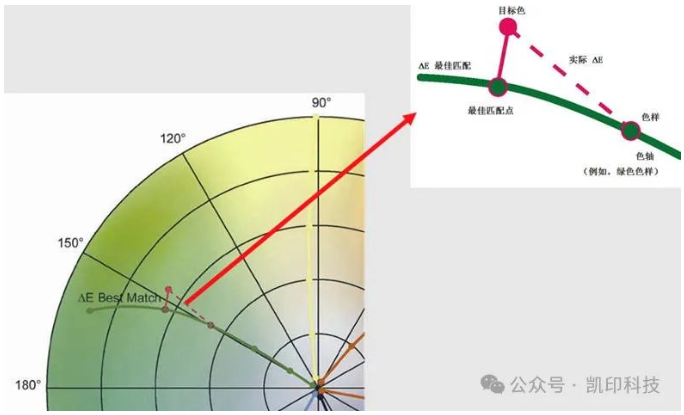
(Figure 1: Best Match Principle Diagram)
So, how much ink density needs to be increased to achieve the best match color difference? Let's take the best match function of X-Rite's classic eXact spectrophotometer as an example, as shown in Figure 2:
(Figure 2: Best Match Test Diagram)
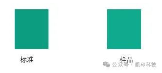
The green on the left is the standard color, and the green on the right is the sample color. We use the best match function of the eXact spectrophotometer to measure, and the results are shown in Figure 3:
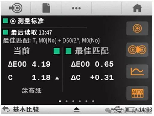
(Figure 3: eXact Best Match Function Diagram)
The current color difference is 4.19, and the best match color difference is 0.65. This means that only by adjusting the ink density or thickness can a color difference of less than 1 be achieved. ΔC +0.31 indicates that increasing the ink amount in the current basis, so that the density of C increases by 0.31 is sufficient. Of course, there are also cases where the best match color difference is relatively large, such as Figure 4:

(Figure 4)
In this case, the best match color difference reaches 5.85, indicating that even adjusting the ink depth is difficult to achieve the ideal color difference. The ink hue is incorrect, and the operator should not waste time adjusting the ink thickness. Remixing the spot color ink is the correct choice. The best match function can be applied not only to offset printing but also to gravure or flexographic printing of liquid inks, such as Figure 5:
(Figure 5)
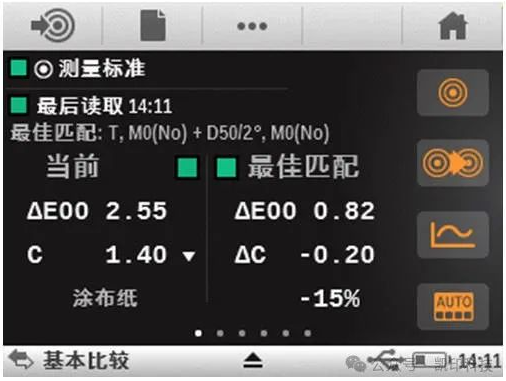
Best Match Function
The figure shows that the best match color difference is 0.82. Only by reducing the concentration of the spot color green ink by 15% can the ideal color difference be achieved, which means only adding some thinner ink is needed, greatly reducing the difficulty of color adjustment for the operator. Many X-Rite software have the best match function, and the application scenarios are also different:
1) ColorCert Scorecard System. ColorCert is a software for scoring print quality. The score will affect the evaluation of suppliers by brand customers. In the figure below (Figure 6), the actual black density is 1.51, and the actual color difference is 2.57, which will inevitably affect the score. According to the best match function, only by reducing the black density to 1.37 can the theoretical color difference be reduced to 0.12, and the score will definitely improve.
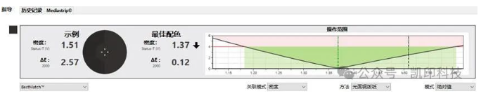
(Figure 6: ColorCert Best Match Function Diagram)
2) IFS Ink Formulation Software. IFS is X-Rite's computer color matching software. Although this software can calculate ink ratios and fundamentally solve the problem of spot color mixing, the best match function is still very important and can help speed up ink mixing, as shown in Figure 7 below:
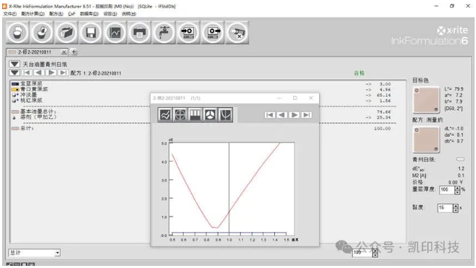
(Figure 7: IFS Best Match Function Diagram)
The actual color difference obtained from the IFS software is 1.2. The colorist encounters a problem: should they continue to correct according to the software's color correction function, or can they go directly to the printing press without correction? At this time, check the best match function in the IFS chart analysis. The color difference in the trough is very small, about 0.4, indicating that there is no need to correct the ink ratio. Only reduce the ink thickness to about 0.9 corresponding to the horizontal axis coordinate during printing, reducing the number of adjustments and improving color matching efficiency.
3) Intellitrax 2 and eXact Auto Scan scanning spectrophotometers. These help the press control the ink keys to control the printing color. The best match function is also very useful. For print preparation, it can quickly determine whether the current paper and ink combination meets international standards or specifications. The software will also recommend the "best density" that can achieve the target L*a*b* chromaticity data to guide printing production, as shown in Figure 8:
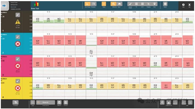
(Figure 8: ITX2 Best Match Function Diagram)
For the C, M, and Y colors, the average actual color difference is above 2. However, through the software's best match function, it is known that as long as the density is reduced to the recommended value, a color difference of less than 0.5 can be obtained. Therefore, it can be quickly determined that the combination of the four-color ink and paper can achieve the target standard by adjusting the ink thickness. This function plays a very important role in print certification or the Finger Print of the printing press.
Controlling Color Difference
Different industries have different requirements for color difference. Normally, a total color difference of about 0.8 can distinguish the color difference. In the printing industry, because color is relatively difficult to control, the color range requirements are relatively relaxed, and anything within the range of 1.5-3 is considered normal. In the electronics industry, the color difference is required to be controlled within 0.5. In the textile industry, the color difference requirement is within 2.0, which is also a relatively large color difference range, for reasons similar to the printing industry. The color difference in the plastics and coatings industries is required to be controlled within 1.0. If it exceeds this range, the product is undoubtedly unqualified. Therefore, when using a color difference meter, you need to determine whether the measured color difference is normal based on the specific industry.
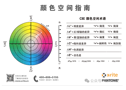
Before understanding its meaning, it is recommended to first understand the color space. The so-called color space refers to a three-dimensional space established with color elements as coordinates. In this space, different colors have corresponding parameters, and each parameter corresponds to only one color, making color quality control simpler.
Current color difference meters do not simply judge colors based on Lab values, because judging solely based on this is not very meaningful. Therefore, when comparing, the Lab values of the color difference meter are often used to judge their color difference. L represents the brightness of the color, a represents the red-green value (positive numbers indicate redder colors, negative numbers indicate greener colors), and b represents the yellow-blue value (positive numbers indicate yellower colors, negative numbers indicate bluer colors).
How to Use a Color Difference Meter
Using a color difference meter is simple. First, place the white plate correctly, then turn on the power switch. You will see a power-on prompt, and the device will perform calibration. After calibration is complete, you can perform measurements. During measurement, press the test button on the right to accurately read the Lab values.
Some of the pictures and texts in this site are collected and collated from the network for learning and exchange only. The copyright belongs to the original author. If you have violated your rights, please contact us to delete them in time.
More News
Kaiyin Technology - Awarded "Specialized and New Enterprise"
Kaiyin Technology, with its professional R&D and service teams, sound management system, and excellent innovation mechanism, successfully passed the enterprise self-assessment, Shenzhen municipal preliminary examination, and national ministry review procedures, ultimately winning multiple honorary titles including "Specialized and New Enterprise," "High-tech Enterprise," and "Innovative Small and Medium-sized Enterprise." The acquisition of these honors is a high recognition of Kaiyin Technology's innovation capabilities, technological R&D strength, and industry specialization, and further affirmation of the company's innovative development achievements. It marks another significant step forward for Kaiyin Technology in technological innovation and development in its specialized field.
Standardized Color Management Strategy for Enhancing Brand Image
Standardization Strategy for Color Management to Enhance Brand Image In today's increasingly competitive market, brand image has become a key factor in a company's success or failure. Color, as an important element affecting brand image, requires standardized management. So, what is color management standardization? Simply put, it is using a consistent color strategy to ensure brand consistency across different channels and touchpoints. Next, we will delve into how to enhance brand image through color management standardization. Psychological Effects of Color Have you noticed that the colors of certain brands can unintentionally resonate with your emotions? For example, red often evokes passion and vitality, while blue gives a sense of stability and trust. These psychological effects of color are not accidental but rather carefully considered strategic choices. Through color management standardization, companies can leverage these psychological effects to enhance consumer brand recognition. For example, fast-food brands often use bright colors to stimulate appetite and desire to buy, while luxury brands tend to use dark tones to convey nobility and elegance. Necessity of Color Management Standardization Imagine if a brand uses bright orange in its online store but uses cool gray in its physical store. This inconsistency will confuse consumers and weaken brand recognition. Therefore, color management standardization is crucial for maintaining a consistent brand image and enhancing consumer trust.
Prepress physical proofing: An important step in improving print quality
Pre-press physical proofing: A crucial step in improving the quality of printed products. In the printing industry, pre-press physical proofing is an indispensable key step. It helps customers and printing companies confirm the design effect in advance, avoiding deviations between the finished product and expectations, thereby reducing unnecessary cost waste. Through physical proofing, the details of color, material, and process can be visually inspected to ensure that the final printed product meets the requirements. The advantage of pre-press physical proofing is that it provides a real sample reference. Compared with digital proofing, physical proofing is closer to the effect of the final product, especially in the application of special processes such as gilding, UV, and embossing. Customers can touch and observe the sample to more accurately evaluate the actual effect and make reasonable adjustments. In addition, physical proofing can also help printing companies optimize production processes, discover potential problems in advance, and improve overall production efficiency. In actual operation, the pre-press physical proofing process usually includes design confirmation, material selection, proofing production, and effect evaluation. Each link needs to be treated rigorously to ensure the accuracy and reliability of the proofing. For example, in color management, professional proofing technology can restore the colors of the design draft to avoid affecting the final effect due to color difference problems. At the same time, choosing the right proofing materials is also very important.
Explore best practices for color management standardization
Exploring Best Practices in Color Management Standardization In modern design and production processes, the importance of color management is self-evident. Have you ever been confused by inconsistent colors in a design project? Do color differences when viewing the same image on different screens leave you feeling helpless? This is where color management standardization comes into play. It not only improves work efficiency but also significantly improves the visual effects of the final product. Let's explore the best practices of color management standardization together. What is color management standardization? Simply put, color management standardization refers to a series of specifications and processes designed to ensure color consistency between different devices (such as monitors, printers, etc.). Imagine how embarrassing it would be if you saw the same poster in different places, but the colors were different each time! Through standardization, we can ensure that designers, printers, and customers see consistent colors. Why is color management standardization so important? First, color management standardization can enhance brand image. Whether in advertising, packaging, or product displays, consistent colors make the brand look more professional. Imagine if a company's logo looks different across different channels, how would customers view that brand? Its


Service Hotline:
180 8888 0185
Address:
605, Building B1, Funian Plaza, No. 3, Shihua Road, Futian District, Shenzhen, Guangdong
Tel:
Fax:
Email:
Copyright ©Shenzhen Kaiyin Technology Co., Ltd 粤ICP备16126578号 SEO
Website support:300.cn ShenZhen
Mobile: 180 8888 0185
Tel: +86 755 8280 8180
Address: 305A, Floor 3, Building B1, Funian Plaza, No. 3, Shihua Road, Futian District, Shenzhen, Guangdong
Email: service@kngcolor.com
We will give you feedback in time


