
Full process prepress and color management solution | National high-tech enterprise | Aisele+Kaiyin Technology Color Lab


Technical Information
Printing technology sharing and the latest industry trends
How is paper whiteness tested? How should the standard be defined?
Release Time: 2025-01-04 00:00:00.000
What is whiteness?
There are many whites in nature, such as snow, lime, cotton, etc. White has the characteristics of high spectral reflectance and low chroma Generally, it is considered that when the reflectance of an object's surface to all wavelengths of the visible spectrum is above 80%, the surface of the substance can be considered white. Whiteness is the "degree of apparent whiteness", which represents the degree of whiteness or near-whiteness of a sample, The larger the value, the whiter it is, generally using WI to represent 。
There are many ways to express whiteness, and different industries use different methods. The more commonly used methods are blue light whiteness and CIE whiteness. In addition, there are Ganz whiteness, Hunter whiteness, and Berger whiteness methods. The printing industry mainly uses Tappi brightness (a kind of blue light whiteness) and CIE whiteness to judge the degree of whiteness of paper or white ink.
Blue light whiteness is a single-band whiteness formula, which measures the diffuse reflectance factor of blue light at a short wavelength of 457 nm, represented by R457. It is mainly divided into Tappi brightness (also known as GE brightness), ISO brightness, and D65 brightness.
Whiteness standards
Below are the standards for different blue light whiteness, and a comparison of optical geometry and light source conditions:
| International Standard | Optical Geometry | Light Source |
| Tappi452 | 45°/0° | CIE C |
| ISO Brightness (ISO2470-1) | Diffuse reflection (d/0°) | CIE C |
| D65 Brightness (ISO2470-2) | Diffuse reflection (d/0°) | CIE D65 |
Next, we will introduce another commonly used whiteness standard in the printing and papermaking industry: CIE whiteness:
CIE whiteness is consistent with the whiteness formula after ASTM E313-95, which is applicable to D65 light source and C light source. ISO11475 and ISO11476 are the CIE whiteness determination of paper and paperboard under outdoor light (D65/10°) and indoor light (C/2°) conditions, respectively. When using CIE whiteness, attention should also be paid to the required light source viewing angle conditions, and the instrument structure type should also be noted.
The CIE whiteness formula is as follows:

• T-Light color tone index
• Y-Y value in the tristimulus values of the sample in the XYZ colorimetric system
• x, y-x and y values in the trichromatic coordinates of the sample in the XYZ colorimetric system
• x0, y0-x0 and y0 values in the trichromatic coordinates of the perfect diffuser in the XYZ colorimetric system under the corresponding light source viewing angle
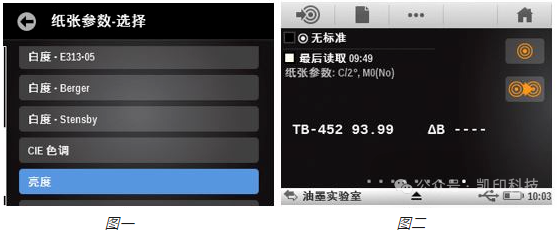
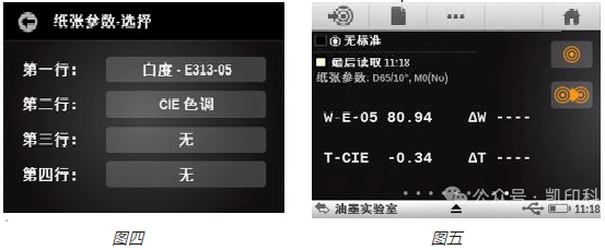
The paper parameter function of X-Rite Spectrophotometer eXact can also measure CIE whiteness. eXact has three ASTM E313 whiteness formulas: E313-SE, E313-98, E313-05. Among them, E313-SE is the same whiteness formula as the old spectrophotometer SpectroEye, which is E313-1973; E313-05 is equivalent to CIE whiteness in measurement values. Figure 3 shows the results of three different E313 formulas for measuring the same type of paper.
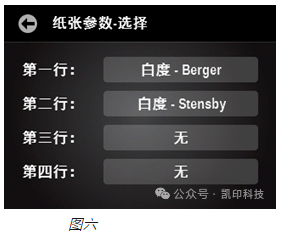
Let's take a certain type of printing paper as an example to measure the CIE whiteness, as shown in Figure 4. The first line is  ,The second line is
  . Figure 5 shows the corresponding CIE whiteness measurement results: CIE whiteness is 80.94; CIE hue is -0.34. When CIE whiteness is greater than 100, it indicates that the sample is blue-toned white, and less than 100 is yellow-toned white, so this paper sample is less than 100, which is yellow-toned white; when the hue index T is greater than 0, it indicates that the sample is biased towards green-toned white, and less than 0 is biased towards red-toned white. This paper sample is negative, which is biased towards red-toned white, so overall, this paper sample is biased towards warm colors.
Then we will introduce other whiteness parameters that eXact can measure, Berger whiteness and Stensby whiteness, as shown in Figure 6:
Berger whiteness formula in the papermaking and textile industries:
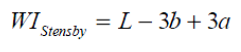
The measurement conditions of the formula are also C/2°. If the Stensby whiteness is greater than 100, it is blue-toned white, and less than 100 is yellow-toned white. Taking a certain paper measurement sample as an example, as shown in Figure 7:
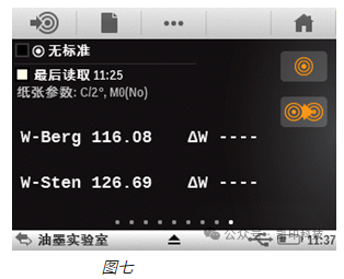
From the data, it can be concluded that this paper sample is blue-toned white.
With the increasingly detailed and specific requirements for whiteness from printing brand manufacturers and third-party testing institutions, it is hoped that printing users can fully understand various different whiteness standards and correctly apply whiteness parameters to daily production work to control material quality and meet customer requirements for paper whiteness parameters.
Some of the pictures and texts in this site are collected and collated from the network for learning and exchange only. The copyright belongs to the original author. If you have violated your rights, please contact us to delete them in time.
More News
Kaiyin Technology - Awarded "Specialized and New Enterprise"
Kaiyin Technology, with its professional R&D and service teams, sound management system, and excellent innovation mechanism, successfully passed the enterprise self-assessment, Shenzhen municipal preliminary examination, and national ministry review procedures, ultimately winning multiple honorary titles including "Specialized and New Enterprise," "High-tech Enterprise," and "Innovative Small and Medium-sized Enterprise." The acquisition of these honors is a high recognition of Kaiyin Technology's innovation capabilities, technological R&D strength, and industry specialization, and further affirmation of the company's innovative development achievements. It marks another significant step forward for Kaiyin Technology in technological innovation and development in its specialized field.
Standardized Color Management Strategy for Enhancing Brand Image
Standardization Strategy for Color Management to Enhance Brand Image In today's increasingly competitive market, brand image has become a key factor in a company's success or failure. Color, as an important element affecting brand image, requires standardized management. So, what is color management standardization? Simply put, it is using a consistent color strategy to ensure brand consistency across different channels and touchpoints. Next, we will delve into how to enhance brand image through color management standardization. Psychological Effects of Color Have you noticed that the colors of certain brands can unintentionally resonate with your emotions? For example, red often evokes passion and vitality, while blue gives a sense of stability and trust. These psychological effects of color are not accidental but rather carefully considered strategic choices. Through color management standardization, companies can leverage these psychological effects to enhance consumer brand recognition. For example, fast-food brands often use bright colors to stimulate appetite and desire to buy, while luxury brands tend to use dark tones to convey nobility and elegance. Necessity of Color Management Standardization Imagine if a brand uses bright orange in its online store but uses cool gray in its physical store. This inconsistency will confuse consumers and weaken brand recognition. Therefore, color management standardization is crucial for maintaining a consistent brand image and enhancing consumer trust.
Prepress physical proofing: An important step in improving print quality
Pre-press physical proofing: A crucial step in improving the quality of printed products. In the printing industry, pre-press physical proofing is an indispensable key step. It helps customers and printing companies confirm the design effect in advance, avoiding deviations between the finished product and expectations, thereby reducing unnecessary cost waste. Through physical proofing, the details of color, material, and process can be visually inspected to ensure that the final printed product meets the requirements. The advantage of pre-press physical proofing is that it provides a real sample reference. Compared with digital proofing, physical proofing is closer to the effect of the final product, especially in the application of special processes such as gilding, UV, and embossing. Customers can touch and observe the sample to more accurately evaluate the actual effect and make reasonable adjustments. In addition, physical proofing can also help printing companies optimize production processes, discover potential problems in advance, and improve overall production efficiency. In actual operation, the pre-press physical proofing process usually includes design confirmation, material selection, proofing production, and effect evaluation. Each link needs to be treated rigorously to ensure the accuracy and reliability of the proofing. For example, in color management, professional proofing technology can restore the colors of the design draft to avoid affecting the final effect due to color difference problems. At the same time, choosing the right proofing materials is also very important.
Explore best practices for color management standardization
Exploring Best Practices in Color Management Standardization In modern design and production processes, the importance of color management is self-evident. Have you ever been confused by inconsistent colors in a design project? Do color differences when viewing the same image on different screens leave you feeling helpless? This is where color management standardization comes into play. It not only improves work efficiency but also significantly improves the visual effects of the final product. Let's explore the best practices of color management standardization together. What is color management standardization? Simply put, color management standardization refers to a series of specifications and processes designed to ensure color consistency between different devices (such as monitors, printers, etc.). Imagine how embarrassing it would be if you saw the same poster in different places, but the colors were different each time! Through standardization, we can ensure that designers, printers, and customers see consistent colors. Why is color management standardization so important? First, color management standardization can enhance brand image. Whether in advertising, packaging, or product displays, consistent colors make the brand look more professional. Imagine if a company's logo looks different across different channels, how would customers view that brand? Its


Service Hotline:
180 8888 0185
Address:
605, Building B1, Funian Plaza, No. 3, Shihua Road, Futian District, Shenzhen, Guangdong
Tel:
Fax:
Email:
Copyright ©Shenzhen Kaiyin Technology Co., Ltd 粤ICP备16126578号 SEO
Website support:300.cn ShenZhen
Mobile: 180 8888 0185
Tel: +86 755 8280 8180
Address: 305A, Floor 3, Building B1, Funian Plaza, No. 3, Shihua Road, Futian District, Shenzhen, Guangdong
Email: service@kngcolor.com
We will give you feedback in time


