
Full process prepress and color management solution | National high-tech enterprise | Aisele+Kaiyin Technology Color Lab


Technical Information
Printing technology sharing and the latest industry trends
Designer's Must-Read | When Should You Use/Replace the Pantone Color Card Formula Guide?
Release Time: 2025-01-06 00:00:00.000

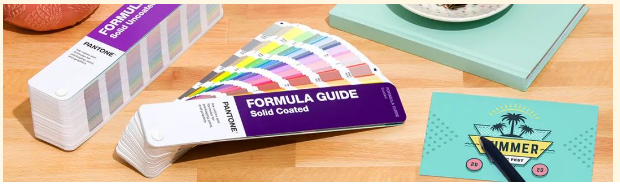
If you are a designer, you must be very familiar with the Pantone Formula Guide. Since 1963, the Pantone Formula Guide has been providing color inspiration, standards, and verification for designers around the world. As a practical and efficient color tool, it can save you time, energy, and money, eliminating many troubles and making communication with colleagues, clients, and suppliers smoother.
When you want to improve communication efficiency
Like many designers, you may have received comments such as "The blue should be a little darker, but not too dark" or "It should be light pink, not bright pink." Ambiguous and subjective understanding of color can lead to ineffective communication and results that neither party can accept. With the Pantone Formula Guide, you can eliminate the uncertainty of color, as the guide is arranged in color order, allowing you to instantly compare all colors in the same color family. When choosing colors with clients, you can be sure that everyone sees the same color.
When you want to reduce color difference
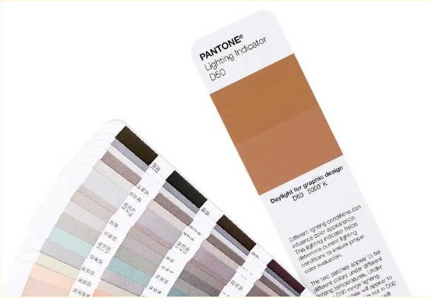
When checking prints or samples, recall the dress that caused a huge controversy on the internet. Whether you see blue and black or white and gold, we must admit that light is very important for color evaluation. Use the Lighting Indicator provided in the Pantone Formula Guide to determine the best lighting for evaluating colors and avoid unnecessary disagreements. As shown below, when the lighting is ideal, the two colors on the Lighting Indicator page will perfectly match; when the lighting is poor, the two colors will differ.
When you lack color inspiration
4 hours left until the deadline, you've already had two double espressos, but your mind is still blank, no inspiration, what should you do? The Pantone Formula Guide is also your good helper. It provides 2161 commonly used colors on the market and arranges them by color system. You can carry it with you, let the rich Pantone colors inspire your inspiration, and make various color combinations anytime, anywhere.
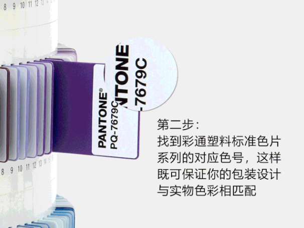
When you need to use other Pantone tools
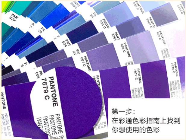
When designing a LOGO for a new bottled beverage, because each plastic color chip has a PMS (Pantone Matching System) color number, you only need to determine the ideal color in the formula guide, and you can find the corresponding color in the Plastics Standard Chips Collection through the color number, so that your packaging design perfectly matches the beverage bottle.
When you want to consistently display colors
Colors often have subtle variations in different materials. For example, the color printing effect is different on glossy coated paper and matte offset paper. Coated paper surfaces can produce a glossy effect, like the magazines you usually see. It is suitable for sharp and complex designs because the ink stays on the paper surface, preventing bleeding. Offset paper has a more porous surface and easily absorbs ink, often used for stationery. It can well demonstrate how colors are reproduced on shipping boxes, stationery, recycled paper, and other offset materials that easily absorb ink.
New colors, new possibilities!
Pantone proudly introduces 224 new colors and 5 base inks, providing designers with a wider range of creative expression and freedom. Having the right color choices is crucial when making design decisions. Now we have a total of 2,390 market-driven Pantone spot colors, imagine the endless possibilities of creativity! In our new global color communication tool series, you can find:

-
A total of 2,390 market-driven Pantone spot colors [Solid PANTONE Colors].
-
New colors appear in Pantone Formula Guides, Solid Chips, and Color Bridge Guides.
-
Collaborated with major brands to develop relevant popular colors that meet the expectations of the modern packaging industry.
-
Emphasizes a specific color range driven by market demand. The industry makes color requests to us, and we respond to these common requests.
-
229 new ways to drive creativity.
-
Bring color into your digital life - learn how the Pantone Connect extension for Adobe® Creative Cloud® allows you to bring true Pantone colors into your digital workflow through Adobe Creative Cloud (InDesign®, Photoshop®, and Illustrator®).
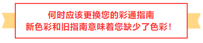
Why update?
If you haven't updated your Pantone guides and swatch books for several years, your colors are no longer fully market-driven and are no longer accurate and reliable. Colors fade and yellow within 12-18 months, meaning guides and swatch books need to be replaced to ensure consistency. To learn more, read here why updating guides will save you valuable production time and money.
These products contain new formulas and are formulated with new base inks that are compatible with coatings during the printing process, and are barium-free and 65% plant-based, making them more environmentally friendly. Pantone guides and swatch books are made to the highest standards. We ensure that each version:
-
High-specification consistency of ink formulas
-
Printed on the most common commercial-grade 100lb and 80lb book paper
-
Carefully supervised during production to avoid defects
However, while we know you may want to keep them forever, due to handling, fading, and aging, the colors become inaccurate over time, and the guides need to be replaced on average every 12 months (depending on your usage and storage habits). Pantone recommends that you update your guides every 12 to 18 months because daily use and exposure can make the colors inaccurate.
-
Contact = Natural oils from fingertips will smudge and remove pigment
-
Paper friction = Scratches or removes pigment
-
Light damage = Fading
-
Paper aging = Yellowing effect
-
High humidity accelerates paper aging
Some of the pictures and texts in this site are collected and collated from the network for learning and exchange only. The copyright belongs to the original author. If you have violated your rights, please contact us to delete them in time.
More News
Kaiyin Technology - Awarded "Specialized and New Enterprise"
Kaiyin Technology, with its professional R&D and service teams, sound management system, and excellent innovation mechanism, successfully passed the enterprise self-assessment, Shenzhen municipal preliminary examination, and national ministry review procedures, ultimately winning multiple honorary titles including "Specialized and New Enterprise," "High-tech Enterprise," and "Innovative Small and Medium-sized Enterprise." The acquisition of these honors is a high recognition of Kaiyin Technology's innovation capabilities, technological R&D strength, and industry specialization, and further affirmation of the company's innovative development achievements. It marks another significant step forward for Kaiyin Technology in technological innovation and development in its specialized field.
Standardized Color Management Strategy for Enhancing Brand Image
Standardization Strategy for Color Management to Enhance Brand Image In today's increasingly competitive market, brand image has become a key factor in a company's success or failure. Color, as an important element affecting brand image, requires standardized management. So, what is color management standardization? Simply put, it is using a consistent color strategy to ensure brand consistency across different channels and touchpoints. Next, we will delve into how to enhance brand image through color management standardization. Psychological Effects of Color Have you noticed that the colors of certain brands can unintentionally resonate with your emotions? For example, red often evokes passion and vitality, while blue gives a sense of stability and trust. These psychological effects of color are not accidental but rather carefully considered strategic choices. Through color management standardization, companies can leverage these psychological effects to enhance consumer brand recognition. For example, fast-food brands often use bright colors to stimulate appetite and desire to buy, while luxury brands tend to use dark tones to convey nobility and elegance. Necessity of Color Management Standardization Imagine if a brand uses bright orange in its online store but uses cool gray in its physical store. This inconsistency will confuse consumers and weaken brand recognition. Therefore, color management standardization is crucial for maintaining a consistent brand image and enhancing consumer trust.
Prepress physical proofing: An important step in improving print quality
Pre-press physical proofing: A crucial step in improving the quality of printed products. In the printing industry, pre-press physical proofing is an indispensable key step. It helps customers and printing companies confirm the design effect in advance, avoiding deviations between the finished product and expectations, thereby reducing unnecessary cost waste. Through physical proofing, the details of color, material, and process can be visually inspected to ensure that the final printed product meets the requirements. The advantage of pre-press physical proofing is that it provides a real sample reference. Compared with digital proofing, physical proofing is closer to the effect of the final product, especially in the application of special processes such as gilding, UV, and embossing. Customers can touch and observe the sample to more accurately evaluate the actual effect and make reasonable adjustments. In addition, physical proofing can also help printing companies optimize production processes, discover potential problems in advance, and improve overall production efficiency. In actual operation, the pre-press physical proofing process usually includes design confirmation, material selection, proofing production, and effect evaluation. Each link needs to be treated rigorously to ensure the accuracy and reliability of the proofing. For example, in color management, professional proofing technology can restore the colors of the design draft to avoid affecting the final effect due to color difference problems. At the same time, choosing the right proofing materials is also very important.
Explore best practices for color management standardization
Exploring Best Practices in Color Management Standardization In modern design and production processes, the importance of color management is self-evident. Have you ever been confused by inconsistent colors in a design project? Do color differences when viewing the same image on different screens leave you feeling helpless? This is where color management standardization comes into play. It not only improves work efficiency but also significantly improves the visual effects of the final product. Let's explore the best practices of color management standardization together. What is color management standardization? Simply put, color management standardization refers to a series of specifications and processes designed to ensure color consistency between different devices (such as monitors, printers, etc.). Imagine how embarrassing it would be if you saw the same poster in different places, but the colors were different each time! Through standardization, we can ensure that designers, printers, and customers see consistent colors. Why is color management standardization so important? First, color management standardization can enhance brand image. Whether in advertising, packaging, or product displays, consistent colors make the brand look more professional. Imagine if a company's logo looks different across different channels, how would customers view that brand? Its


Service Hotline:
180 8888 0185
Address:
605, Building B1, Funian Plaza, No. 3, Shihua Road, Futian District, Shenzhen, Guangdong
Tel:
Fax:
Email:
Copyright ©Shenzhen Kaiyin Technology Co., Ltd 粤ICP备16126578号 SEO
Website support:300.cn ShenZhen
Mobile: 180 8888 0185
Tel: +86 755 8280 8180
Address: 305A, Floor 3, Building B1, Funian Plaza, No. 3, Shihua Road, Futian District, Shenzhen, Guangdong
Email: service@kngcolor.com
We will give you feedback in time


